 nathan leclaire
Creating and Visualizing Embeddings with Ollama and ChatGPT
To effectively utilize Language Models (LLMs) with text, you first need to convert the text into numbers. Despite the complex terminology that might be used, this is essentially what embeddings are. If you’re subsequently using text in your prompt (like in the case of RAG), it’s beneficial to pre-calculate and store these embeddings in your knowledge base.
It’s incredibly easy with a tool like Ollama - just make a curl call:
$ curl -s http://localhost:11434/api/embeddings -d "{"model":"nomic-embed-text","prompt":" $(cat /tmp/prompt) "}" | jq .
{
  "embedding": [
    0.6371732354164124,
    0.45353594422340393,
    -4.1606903076171875,
    0.021639127284288406...
Now, we are dealing with a series of floating point numbers. It’s important to understand what they mean and how we can visualize them more effectively. To enhance the results of RAG and LLM, we need to comprehend both intuitively and practically why and how certain elements get clustered together.
Embeddings from the ollama are a 768-dimensional vector, consisting of 768 numbers. The position of these numbers within the vector doesn’t matter. What matters is their relative values when compared to the same dimensions in other embeddings. The more similar they are, the closer they’ll be to your original query. If we want to use these dimensions effectively for charting, we may need to be more creative. More on this later.
I utilized ChatGPT to analyze llama JSON files and create charts. These were associated with Bauplan, my current employer, and Databricks.
Initially, I thought of visualizing the data as a heatmap, with each “pixel” representing a dimension from the vector. Although it looked interesting, it essentially appeared as random noise.
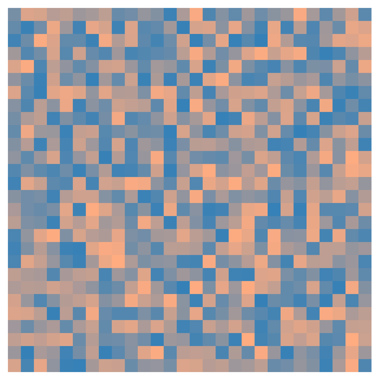
You can kinda bin that out and make it slightly more readable, but comparing it side by side with another still doesn’t offer much help unless you look very closely. Remember, positions don’t actually matter. Any attempt to identify patterns in the 2D structure, as opposed to just one pixel, is merely our minds playing tricks on us.
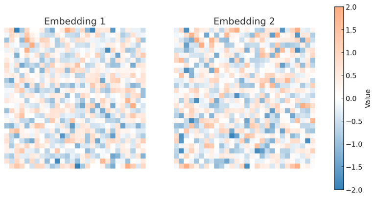
However, you can observe subtle differences in vector dimensions “firing” or not, which seems like progress.
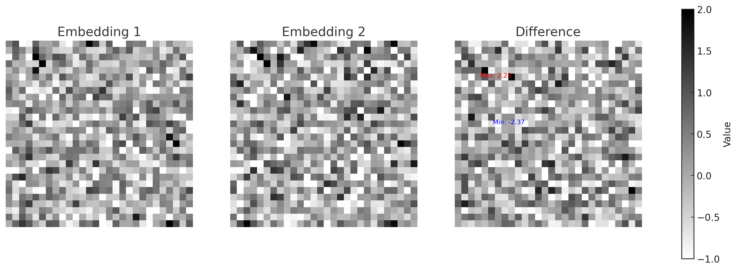
I’m unsure if colors add much value to these style charts. You could consider making them in grayscale, adding a Euclidean distance chart. While cosine similarity might be better, let’s stick with this for now. Label the most significant differences with colored text. This method could hold potential, as the dimensions with the greatest distance likely contribute most to the final cosine distance.
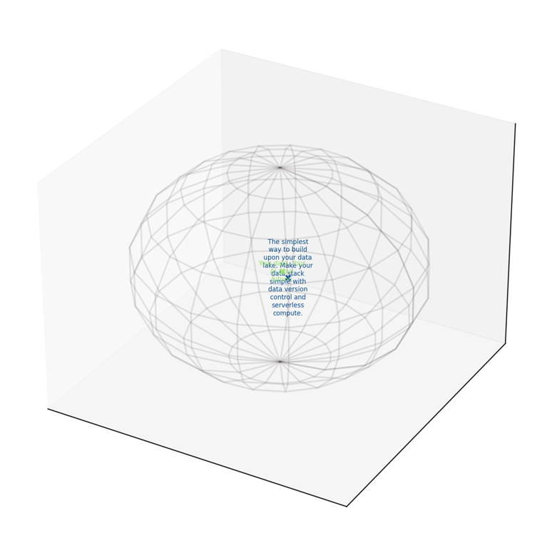
This article discusses visualizing embeddings on a hypersphere, and plugging it in to ChatGPT gave an interesting, albeit limited and potentially incorrect, implementation/idea:
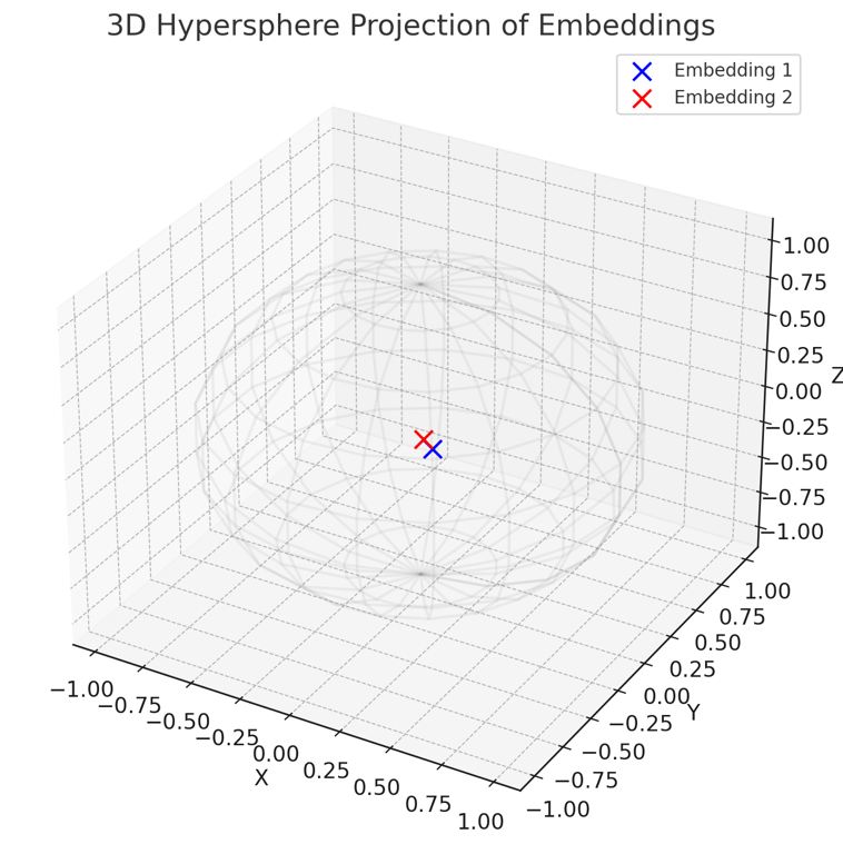
The visualization above represents a projection of the token embeddings onto a 3D hypersphere. This projection is created by normalizing the embeddings and taking their first three components to represent their position in a three-dimensional space.In the plot:
- The blue point represents the projection of Embedding 1.
- The red point represents the projection of Embedding 2.
The wireframe sphere illustrates the hypersphere concept, where each point (token vector) is not merely a point in space but rather a direction from the origin. The vectors' endpoints lie on the surface of the sphere, emphasizing that it’s the direction and magnitude (represented in 3D space) that are crucial, aligning with the idea that token vectors in a transformer model represent directions on a hypersphere.
I believe this is heading in the right direction, but there are a few changes I’d like to see in the chart. First, it’s a bit cluttered and could use some tidying up. Also, I don’t see the need for a legend; it might be more effective to label the visualization directly, similar to Google Maps.
Doing it more like that pleased the Tuftian in me.
However, another issue arises. The “hyper” sphere only visualized the first three dimensions, not living up to its name. So, albeit unsure if this idea is ingenious or simply absurd, I considered incorporating more embeddings, running principal components on them, and visualizing the results. This would greatly enhance our understanding of their relative positions. We could also slightly adjust the font transparency for better layering, and increase the size of the text closer to the viewers. The expected outcome would look something like this.
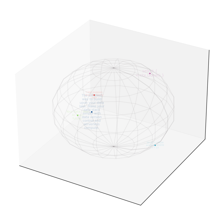
Even though I believe the PCA contradicts the original hypersphere article’s objective, it’s still somewhat enjoyable. I find the varying font sizes particularly useful. They make it easier to conceptualize the relative distances of different elements, such as the red dot being further away in one direction than the blue, and so forth.
Another idea that might be interesting is choosing the N dimensions with greatest cosine distance and making N/3 small multiples charts like that with the embedding values. That would improve the signal to noise ratio (since only the most distant would be presented) and would make the charts not directly comparable (since different dimensions would be chosen each time) but might still help with evals.
The next steps are to further develop RAG splitting and deepen our understanding of it. This approach will likely be beneficial, as it will provide a swift visual representation of the embedding in Tensorscale previews.